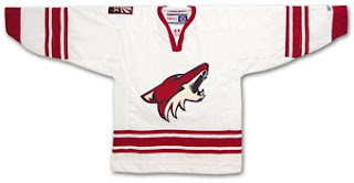
Since there isn't much going on right now, and most people are talking about the new jerseys still, I thought I might linger on that subject a little longer.
Having seen a few of the new Rbk Edge jerseys, and the damage their design has done, I am hoping that those not yet revealed haven't been mishandled as much. To the following jerseys any change would be only bad, Chicago Blackhawks, Phoenix Coyotes, NY Islander and the NY Rangers. The Coyotes has by far the best looking jersey out of all the newer teams and it would be sad if it was ruined. I mean they really went from ugly (the Lego-looking coyote that made you think you just dropped acid)to cool (the howling coyote on the traditionally clean looking jersey).
It is clear that Reebok has no real sense of what a hockey shirt should look like and I hope that one day CCM will once again provide the NHL with classy uniforms. Until then I urge all fans (even the ones from Beantown) to buy old or replica jerseys.
One thing that really bothers me is that little NHL logo at the front of the neck. What the hell is that for?
2 comments:
Just saw the Habs' and the Flames' new jerseys. If it ain't broken then don't fix it. That's the attitude behind the new designs and rightly so. Except for Calgary's new shoulder patches: flags!
The Flames jersey is now donned with a provincial Alberta flag on one shoulder and a national Canadian flag on the other. Don't think I like the looks of this at all and the reason for this is twofold.
First, the flags look totally out of place. They don't even appear to be evenly placed shoulder patches. They simply seem asymmetrical.
Secondly, I have never been a fan of any sign of nationalism on club jerseys or equipment. Team jerseys should represent the franchise, city, or region only. Not countries. That's what national teams are for and that's where, in this case, a Canada flag looks great.
Except for the NHL collar logo I do like the Habs jersey, only because it looks pretty much exactly the same as before (which it, so far, only shares with the Red Wings).
As for the Flame's new shirt, I gotta say I really hate it. It almost makes me wonder if some organizations are deliberately trying to piss off their loyal fans. I do agree the national flag does not belong on a club jersey, but the rest of the thing is so busy I don't know where to look. Stripes and patches everywhere!
Being from Sweden, where hockey uniforms (and all other sports for that matter) are totally covered in advertisement, I have always liked the NHL jerseys because they have been simple and timeless in design.
The original six teams of the NHL represent something that is disappearing around the league, namely tradition. I am somewhat glad that those teams are sticking to their old jerseys (as best they can), and I wish some of the newer teams (teams from 1967-2000) would follow suit. A tradition has to start somewhere. I would hate to see the Blackhawks or the Devils all covered in ads.
Post a Comment